Breadcrumb navigation is a useful element to indicate the exact location of a product/post on the webpage. It also helps users to browse the relevant content related to the current item. On the other hand, a breadcrumb is an SEO-friendly item because it makes it easier to browse (and crawl) the site content. Mostly, breadcrumb navigation links separated with a symbol (slash, arrow, triangles, etc) that created in CSS.
In this tutorial, we are going to design three types of (General, Steps, and Arrows) breadcrumb navigations. We’ll use the HTML unordered list of links and then style the list items (& links) into horizontal breadcrumb navigation. You can check all these breadcrumbs on the demo page before getting started with coding.
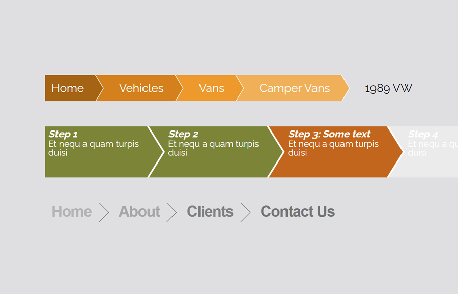
As you have seen on the above preview (or on the demo page), there are three different designs for breadcrumb. You can implement one of them into your project that fits your needs. Besides these designs, you can also highly customize by changing the background color, text size, etc. So, let’s get started with HTML to create the breadcrumb navigation.
HTML Structure for Breadcrumb Navigation
For a general-purpose breadcrumb, create a ul element with a class name "breadcrumb" and place a list of links inside it. Basically, these are links of categories and subcategories until the content. So, place the links according to your site’s content categories.
<ul class="breadcrumb">
  <li><a href="#">Home</a></li>
  <li><a href="#">Vehicles</a></li>
  <li><a href="#">Vans</a></li>
  <li><a href="#">Camper Vans</a></li>
  <li><a href="#">1989 VW Westfalia Vanagon</a></li>
</ul>
Another type of breadcrumb navigation is “steps” that you can place above a registration form or any steps-based activity. Create the HTML structure for steps as follows:
<ul class="steps steps-5">
  <li><a href="#" title=""><em>Step 1</em><span>Et nequ a quam turpis duisi</span></a></li>
  <li><a href="#" title=""><em>Step 2</em><span>Et nequ a quam turpis duisi</span></a></li>
  <li class="current"><a href="#" title=""><em>Step 3: Some text</em><span>Et nequ a quam turpis duisi</span></a></li>
  <li><a href="#" title=""><em>Step 4</em><span>Et nequ a quam turpis duisi</span></a></li>
  <li><a href="#" title=""><em>Step 5</em><span>Et nequ a quam turpis duisi</span></a></li>
</ul>
If you want to create very basic breadcrumb navigation links separated with arrow icons. Then create the list of links wrapped in an ordered list and define its class name "arrows".
<ol class="arrows">
   <li><a href="#">Home</a></li>
   <li><a href="#">About</a></li>
   <li><a href="#">Clients</a></li>
   <li><a href="#">Contact Us</a></li>
</ol>
You can choose one of the above HTML structures for a breadcrumb according to your needs. Now, we’ll style these navigations using CSS.
The CSS Styles
In CSS, create the style for general breadcrumb navigation. Target the ul element (that’s class "breadcrumb") and define its styles as mentioned below:
.breadcrumb {
  list-style: none;
  overflow: hidden;
  font: 18px Helvetica, Arial, Sans-Serif;
  margin: 40px;
  padding: 0;
}
As we are going to make the list items in a horizontal layout, we need to float list items. So, use the CSS float left property for the breadcrumb li (list item).
.breadcrumb li {
  float: left;
}
Now, target the hyperlinks and define CSS styles. Keep the relative position and display it as a block element. You can set the custom color, text size, and padding, etc.
.breadcrumb li a {
  color: white;
  text-decoration: none;
  padding: 10px 0 10px 55px;
  background: brown; /* fallback color */
  background: hsla(34,85%,35%,1);
  position: relative;
  display: block;
  float: left;
}
Use the CSS after pseudo selector for list items and create the following styles in order to make triangles.
.breadcrumb li a:after {
  content: " ";
  display: block;
  width: 0;
  height: 0;
  border-top: 50px solid transparent;           /* Go big on the size, and let overflow hide */
  border-bottom: 50px solid transparent;
  border-left: 30px solid hsla(34,85%,35%,1);
  position: absolute;
  top: 50%;
  margin-top: -50px;
  left: 100%;
  z-index: 2;
}
.breadcrumb li a:before {
  content: " ";
  display: block;
  width: 0;
  height: 0;
  border-top: 50px solid transparent;           /* Go big on the size, and let overflow hide */
  border-bottom: 50px solid transparent;
  border-left: 30px solid white;
  position: absolute;
  top: 50%;
  margin-top: -50px;
  margin-left: 1px;
  left: 100%;
  z-index: 1;
}
In order to make the breadcrumb stylish use different background colors for each link. You can set the custom color scheme according to your theme.
.breadcrumb li:first-child a {
  padding-left: 10px;
}
.breadcrumb li:nth-child(2) a       { background:        hsla(34,85%,45%,1); }
.breadcrumb li:nth-child(2) a:after { border-left-color: hsla(34,85%,45%,1); }
.breadcrumb li:nth-child(3) a       { background:        hsla(34,85%,55%,1); }
.breadcrumb li:nth-child(3) a:after { border-left-color: hsla(34,85%,55%,1); }
.breadcrumb li:nth-child(4) a       { background:        hsla(34,85%,65%,1); }
.breadcrumb li:nth-child(4) a:after { border-left-color: hsla(34,85%,65%,1); }
.breadcrumb li:nth-child(5) a       { background:        hsla(34,85%,75%,1); }
.breadcrumb li:nth-child(5) a:after { border-left-color: hsla(34,85%,75%,1); }
.breadcrumb li:last-child a {
  background: transparent !important;
  color: black;
  pointer-events: none;
  cursor: default;
}
.breadcrumb li:last-child a:after { border: 0; }
.breadcrumb li a:hover { background: hsla(34,85%,25%,1); }
.breadcrumb li a:hover:after { border-left-color: hsla(34,85%,25%,1) !important; }
Breadcrumb Steps Navigation CSS Styles
The "steps" class defines the unordered list of step’s links. Define its margin as 40px and keep the overflow hidden.
.steps {
  margin: 40px;
  padding: 0;
  overflow: hidden;
}
After that, set the color for the links.
.steps a {
  color: white;
  text-decoration: none;
}
The “em” element of the steps contains the title of the step. Display it as a block and define font-size.
.steps em {
  display: block;
  font-size: 1.1em;
  font-weight: bold;
}
Similarly, define the CSS style for the list items as follows:
.steps li {
  float: left;
  margin-left: 0;
  width: 150px; /* 100 / number of steps */
  height: 70px; /* total height */
  list-style-type: none;
  padding: 5px 5px 5px 30px; /* padding around text, last should include arrow width */
  border-right: 3px solid white; /* width: gap between arrows, color: background of document */
  position: relative;
}
The triangles for the steps navigation are quite similar to the above-mentioned triangles. So, specify its styles as described below:
.steps li:first-child {
  padding-left: 5px;
}
/* white arrow to the left to "erase" background (starting from the 2nd object) */
.steps li:nth-child(n+2)::before {
  position: absolute;
  top:0;
  left:0;
  display: block;
  border-left: 25px solid white; /* width: arrow width, color: background of document */
  border-top: 40px solid transparent; /* width: half height */
  border-bottom: 40px solid transparent; /* width: half height */
  width: 0;
  height: 0;
  content: " ";
}
/* colored arrow to the right */
.steps li::after {
  z-index: 1; /* need to bring this above the next item */
  position: absolute;
  top: 0;
  right: -25px; /* arrow width (negated) */
  display: block;
  border-left: 25px solid #7c8437; /* width: arrow width */
  border-top: 40px solid transparent; /* width: half height */
  border-bottom: 40px solid transparent; /* width: half height */
  width:0;
  height:0;
  content: " ";
}
Define the setup colors (both the background and the arrow) as described in the below snippet. You can set the custom values for the colors in order to customize it.
/* Completed */
.steps li { background-color: #7C8437; }
.steps li::after { border-left-color: #7c8437; }

/* Current */
.steps li.current { background-color: #C36615; }
.steps li.current::after { border-left-color: #C36615; }

/* Following */
.steps li.current ~ li { background-color: #EBEBEB; }
.steps li.current ~ li::after {	border-left-color: #EBEBEB; }

/* Hover for completed and current */
.steps li:hover {background-color: #696}
.steps li:hover::after {border-left-color: #696}
Arrows Breadcrumb Navigation CSS Styles
If you want to create a simple breadcrumb, then create the CSS styles for the “arrows” class as follow:
.arrows { white-space: nowrap; }
.arrows li {
    display: inline-block;
    line-height: 26px;
    margin: 0 9px 0 -10px;
    padding: 0 20px;
    position: relative;
}
Target the list items with a before pseudo selector and specify the CSS styles for the arrow symbol.
.arrows li::before,
.arrows li::after {
    border-right: 1px solid #666666;
    content: '';
    display: block;
    height: 50%;
    position: absolute;
    left: 0;
    right: 0;
    top: 0;
    z-index: -1;
    transform: skewX(45deg);
}
.arrows li::after {
    bottom: 0;
    top: auto;
    transform: skewX(-45deg);
}

.arrows li:last-of-type::before,
.arrows li:last-of-type::after {
    display: none;
}
Similarly, specify the links styles as follows:
.arrows li a {
   font: bold 24px Sans-Serif;
   letter-spacing: -1px;
   text-decoration: none;
}
Finally, define the colors for links and done.
.arrows li:nth-of-type(1) a { color: hsl(0, 0%, 70%); }
.arrows li:nth-of-type(2) a { color: hsl(0, 0%, 65%); }
.arrows li:nth-of-type(3) a { color: hsl(0, 0%, 50%); }
.arrows li:nth-of-type(4) a { color: hsl(0, 0%, 45%); }
That’s all! Hopefully, you have successfully implemented breadcrumb navigation with triangles symbol using this CSS tutorial. If you have any questions or need further help, let me know by comment below.