Do you want to create 3D hover effects on images? If yes, then you are absolutely in the right place. Here I’m going to share a jQuery code snippet to create mindblowing 3D thumbnail hover effects with step by step code implementation guide.
Before going further, go on the demo page and check these hover effects in action. Basically, it’s a lightweight jQuery plugin that comes with four different3D effects built-in CSS3. Whether you want to create these effects on the gallery image thumbnails or on the images grid. You can easily integrate this plugin to make these transformation effects on your thumbnails.
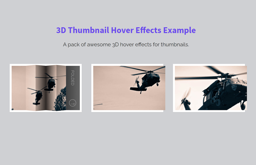
OK! now let’s know what we are going to create. As you have seen on the demo page, there is a grid of images/thumbnails having overlay with text and a link that reveals on hover. So, we’ll create a grid of images and apply hoverfold() plugin to make the 3D hover effects.
How to Create 3D Hover Effects on Thumbnail
First of all, create the HTML structure for your images as follows:
<div id="grid" class="main">

  <!-- 1 -->
  <div class="view">
    <div class="view-back">
      <span>Folded</span>
      <a href="http://www.flickr.com/photos/willinteractive/5884566609/" title="PF-9807.jpg by willinteractive, on Flickr">→</a>
    </div>
    <img src="https://farm6.staticflickr.com/5240/5884566609_9731cf0786.jpg" width="300" height="200" alt="PF-9807">
  </div>

  <!-- 2 -->
  <div class="view">
    <div class="view-back">
      <span>Curve up</span>
      <a href="http://www.flickr.com/photos/willinteractive/5884567683/" title="PF-9817.jpg by willinteractive, on Flickr">→</a>
    </div>
		<img src="https://farm7.staticflickr.com/6018/5884567683_cdf88797a5.jpg" width="300" height="200" alt="PF-9817">
  </div>

  <!-- 3 -->
  <div class="view">
    <div class="view-back">
      <span>Curve Down</span>
      <a href="http://www.flickr.com/photos/willinteractive/5884568609/" title="PF-9818.jpg by willinteractive, on Flickr">→</a>
    </div>
    <img src="https://farm6.staticflickr.com/5199/5884568609_2fc30c874d.jpg" width="300" height="200" alt="PF-9818">
  </div>

  <!-- 4 -->
  <div class="view">
    <div class="view-back">
      <span>Half-Folded</span>
      <a href="http://www.flickr.com/photos/willinteractive/5884569375/" title="PF-9835.jpg by willinteractive, on Flickr">→</a>
    </div>
    <img src="https://farm6.staticflickr.com/5305/5884569375_f9a773a945.jpg" width="300" height="200" alt="PF-9835">
  </div>

</div>
You just need to update your thumbnail links, caption, and target link in the above HTML code. You can add more images in the same way as placed 4 images in the <div class="view"> container.
Basic CSS Styles
After creating an HTML structure for the image thumbnails, now it’s time to arrange them into a grid layout. So, target the "view" class (that is the wrapper element of each image) and set its width, height, margin, and box-shadow as described below. You can set the custom values for width and height if you want to increase/decrease the size of thumbnails.
.view {
  width: 300px;
  height: 200px;
  margin: 20px;
  float: left;
  position: relative;
  border: 8px solid #fff;
  box-shadow: 1px 1px 2px rgba(0, 0, 0, 0.05);
  background: #333;
  perspective: 500px;
}
Set the absolute position for the thumbnail image. Define the CSS transition property for the left property for smoothness.
.view img {
  position: absolute;
  z-index: 0;
  transition: left 0.3s ease-in-out;
}
Specify the common CSS transformation for all hover effects.
.view .s2, .view .s3, .view .s4, .view .s5 {
  transform: translateX(60px);
}
.view .s1, .view .s2, .view .s3, .view .s4, .view .s5 {
  background-position-y: -60px;
}
.view .s1 {
  background-position-x: -120px;
}
.view .s2 {
  background-position-x: -180px;
}
.view .s3 {
  background-position-x: -240px;
}
.view .s4 {
  background-position-x: -300px;
}
.view .s5 {
  background-position-x: -360px;
}
Now, target the "overlay" class and define an absolute position, 60px width, and 100% height. We’ll show the overlayed element on the hover event. So, use the CSS opacity property with the 0 value to make it invisible.
.view .overlay {
  width: 60px;
  height: 100%;
  opacity: 0;
  position: absolute;
  transition: opacity 150ms ease-in-out;
}
Define the opacity value 1 on the hover pseudo-selector to make the overlay visible on hover events.
.view:hover .overlay {
  opacity: 1;
}
The "view-back" class define the content behind the thumbnail. It contains image caption and link that displays on hover. Define its CSS styles as follows:
.view div.view-back {
  width: 50%;
  height: 100%;
  position: absolute;
  right: 0;
  background: #666;
  z-index: 0;
}
.view div.view-back span {
  position: absolute;
  left: 80px;
  bottom: 120px;
  color: rgba(255, 255, 255, 0.4);
  text-transform: uppercase;
  transform: rotate(90deg);
  z-index: 0;
}
Define the CSS styles for the caption link as described in the following snippet.
.view div.view-back a {
  display: bock;
  font-size: 18px;
  color: rgba(255, 255, 255, 0.4);
  position: absolute;
  right: 15px;
  bottom: 15px;
  border: 2px solid rgba(255, 255, 255, 0.3);
  border-radius: 50%;
  width: 30px;
  height: 30px;
  line-height: 31px;
  text-align: center;
  font-weight: bold;
  text-decoration: none;
}
.view div.view-back a:hover {
  color: #fff;
  border-color: #fff;
}
3D Hover Effects CSS
So, you have created the basic grid layout for the thumbnails. Now, it’s time to apply the 3D effects on them. To to do this, copy one of the following effects snippets to keep your code size lightweight.
FOLDING EFFECT:
/* FOLDING EFFECT */
.view:first-of-type {
  perspective: 1050px;
}
.view:first-of-type div {
  transition: all 0.3s ease-in-out;
}
.view:first-of-type:hover .s2 {
  transform: translate3d(59px, 0, 0) rotate3d(0, 1, 0, -45deg);
}
.view:first-of-type:hover .s3, .view:first-of-type:hover .s5 {
  transform: translate3d(59px, 0, 0) rotate3d(0, 1, 0, 90deg);
}
.view:first-of-type:hover .s4 {
  transform: translate3d(59px, 0, 0) rotate3d(0, 1, 0, -90deg);
}
.view:first-of-type .s1 > .overlay {
  background: linear-gradient(to left, rgba(0, 0, 0, 0.05) 0%, rgba(0, 0, 0, 0) 100%);
}
.view:first-of-type .s2 > .overlay {
  background: linear-gradient(to right, rgba(255, 255, 255, 0) 0%, rgba(255, 255, 255, 0.2) 100%);
}
.view:first-of-type .s3 > .overlay {
  background: linear-gradient(to left, rgba(0, 0, 0, 0.8) 0%, rgba(0, 0, 0, 0.2) 100%);
}
.view:first-of-type .s4 > .overlay {
  background: linear-gradient(to right, rgba(0, 0, 0, 0.8) 0%, rgba(0, 0, 0, 0) 100%);
}
.view:first-of-type .s5 > .overlay {
  background: linear-gradient(to right, rgba(0, 0, 0, 0.3) 0%, rgba(0, 0, 0, 0) 100%);
}
.view:first-of-type div.view-back {
  background: linear-gradient(to right, #0a0a0a 0%, #666666 100%);
}
CURVED UP EFFECT:
.view:nth-of-type(2) {
  perspective: 800px;
}
.view:nth-of-type(2):hover .s1 {
  transition-delay: 200ms;
  transform: rotate3d(0, 1, 0, -3deg);
}
.view:nth-of-type(2):hover .s2 {
  transition-delay: 150ms;
  transform: translate3d(59px, 0, 0) rotate3d(0, 1, 0, -10deg);
}
.view:nth-of-type(2):hover .s3 {
  transition-delay: 100ms;
  transform: translate3d(59px, 0, 0) rotate3d(0, 1, 0, -16deg);
}
.view:nth-of-type(2):hover .s4 {
  transition-delay: 50ms;
  transform: translate3d(59px, 0, 0) rotate3d(0, 1, 0, -30deg);
}
.view:nth-of-type(2):hover .s5 {
  transform: translate3d(60px, 0, 0) rotate3d(0, 1, 0, -42deg);
}
.view:nth-of-type(2) .s4 > .overlay {
  background: linear-gradient(to left, rgba(0, 0, 0, 0.3) 0%, rgba(0, 0, 0, 0) 100%);
}
.view:nth-of-type(2) .s5 > .overlay {
  background: linear-gradient(to right, rgba(0, 0, 0, 0.3) 0%, rgba(0, 0, 0, 0) 100%);
}
.view:nth-of-type(2) div.view-back {
  background: #0a0a0a;
  background: linear-gradient(to right, #0a0a0a 0%, #666666 100%);
}
CURVED DOWN EFFECT:
.view:nth-of-type(3) {
  perspective: 1000px;
}
.view:nth-of-type(3):hover .s1 {
  transform: rotate3d(0, 1, 0, -55deg);
}
.view:nth-of-type(3):hover .s2, .view:nth-of-type(3):hover .s5 {
  transform: translate3d(59px, 0, 0) rotate3d(0, 1, 0, 20deg);
}
.view:nth-of-type(3):hover .s3 {
  transform: translate3d(59px, 0, 0) rotate3d(0, 1, 0, 30deg);
}
.view:nth-of-type(3):hover .s4 {
  transform: translate3d(59px, 0, 0) rotate3d(0, 1, 0, 40deg);
}
.view:nth-of-type(3) .s1 > .overlay {
  background: linear-gradient(to right, rgba(0, 0, 0, 0.3) 0%, rgba(0, 0, 0, 0) 100%);
}
.view:nth-of-type(3) .s5 > .overlay {
  background: linear-gradient(to left, rgba(0, 0, 0, 0.4) 0%, rgba(0, 0, 0, 0) 100%);
}
The jQuery 3D Hover Function
Finally, load the jQuery and plugin script (before closing the body tag) to active the 3D hover effects.
  <script src='https://cdnjs.cloudflare.com/ajax/libs/jquery/2.1.3/jquery.min.js'></script>
  <script>
      (function($) {
    $.fn.hoverfold = function(options) {
      this.each( function() {
			$( this ).children( '.view' ).each( function() {
				var $item 	= $( this ),
					img		= $item.children( 'img' ).attr( 'src' ),
					struct	= '<div class="slice s1">';
						struct	+='<div class="slice s2">';
							struct	+='<div class="slice s3">';
								struct	+='<div class="slice s4">';
									struct	+='<div class="slice s5">';
									struct	+='</div>';
								struct	+='</div>';
							struct	+='</div>';
						struct	+='</div>';
					struct	+='</div>';
				var $struct = $( struct );
				$item.find( 'img' ).remove().end().append( $struct ).find( 'div.slice' ).css( 'background-image', 'url(' + img + ')' ).prepend( $( '<span class="overlay" ></span>' ) );
			} );
		});
	};
})(jQuery);

	$(function() {
		$('#grid').hoverfold();
	});

  </script>
You have done! let me know by comment below if you have successfully integrated these 3D effects over your thumbnails.